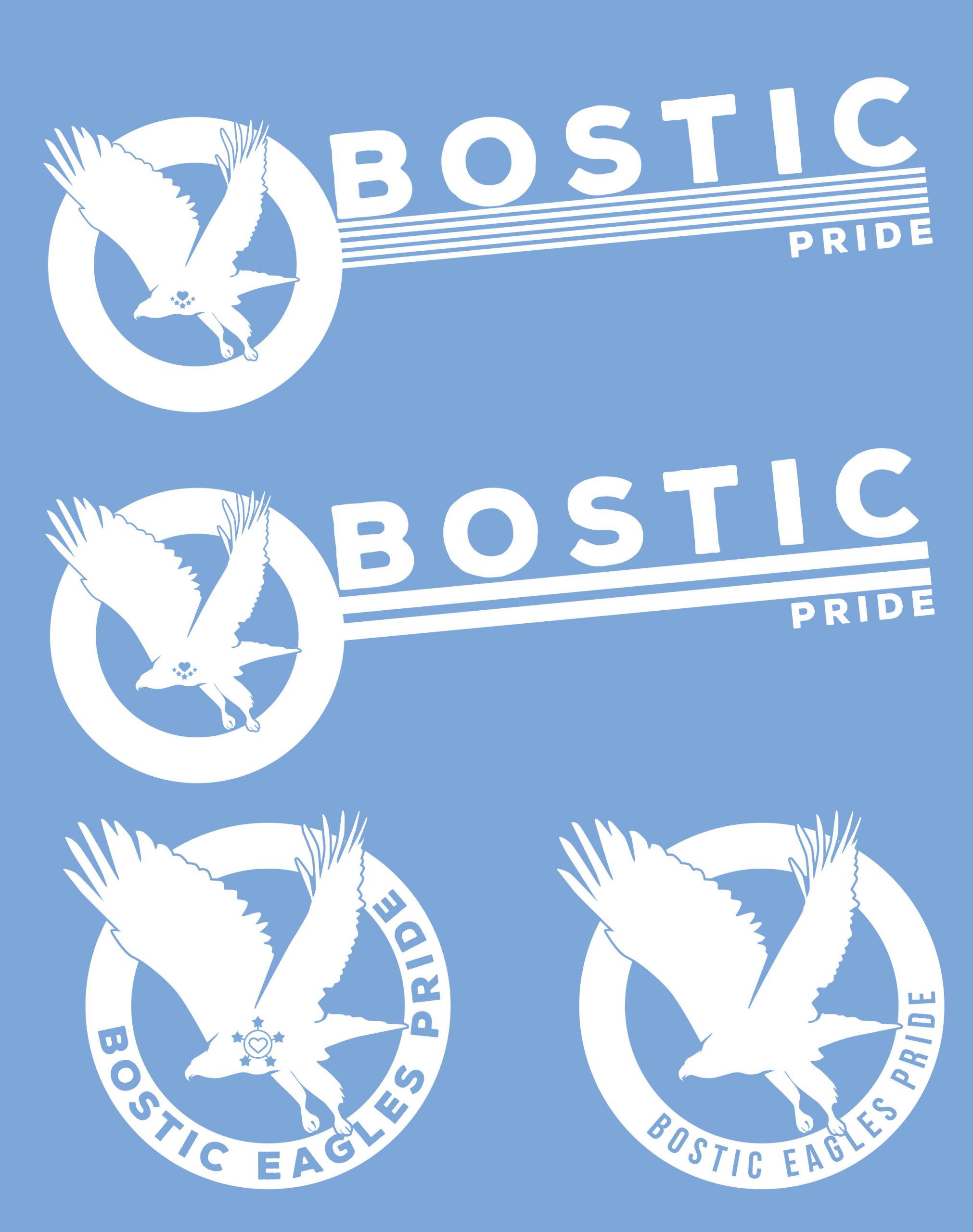
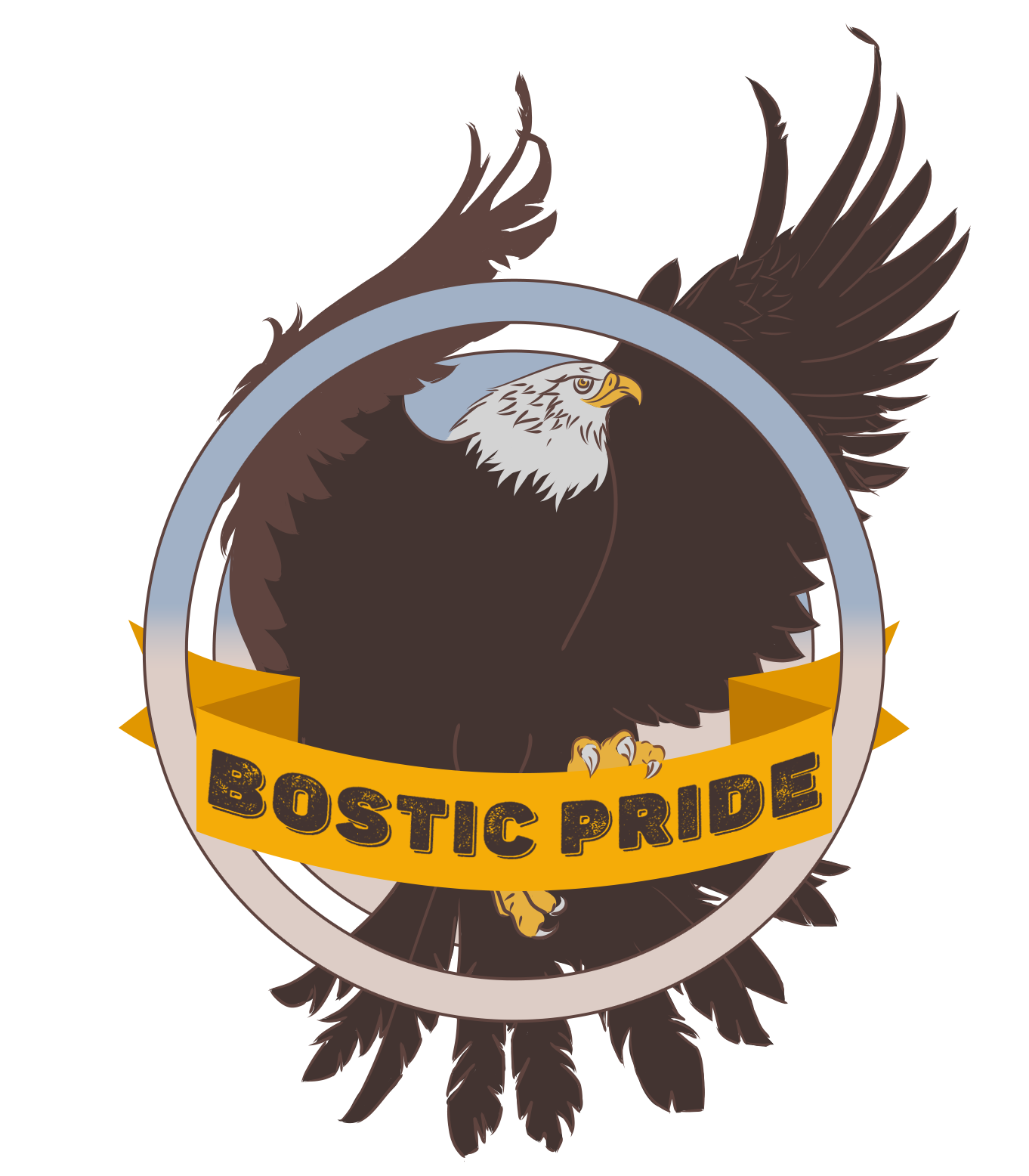
Branding Design

Impact Campaigns Branding Samples

Currently in progress contract for Impact Campaigns LLC. 
This brand deck is only from the preview stage, as the current versions are classed as proprietary content.

Bostic Pride

A series of logos and an illustration for the Bostic Academy in Kansas.

The schools motto includes “The 5 virtues of the heart of the eagle”. A bit of a mouthful. These include things like Responsibility and Respect etc.

Due to the eagle motif, I based the logo on classic americana, incorporating stars and stripes. 

The eagles chest incorporates a heart surrounded by 5 stars, representing the virtues mentioned in the schools motto.

The coloured eagle was an early concept for the logo styling, but was recycled for use on sports event t-shirts.

The eagles were custom made elements.

Birch Corporate Finance

A Series of logos and branding guidelines for a large scale start-up company.

The main colour scheme was based on the natural colours of birch trees, however with was every similar to the scheme used by its affiliated company “Fellows Property Consultants”. The client ended up choosing the similar scheme so the brands work well together.

The logo designs were mostly based around the image of birch trees or leaves.

HumanKind Ministries U.S
Sleep Out/Speak Out

A Series of logos for a campaign ran by HumanKind Ministries, a large scale non-profit.

The Campaign was to raise awareness about homelessness in Kanses and the broader U.S.

The brief required my to incorporate their exiting brand and create an emblem like design that could be printed onto a variety of products.

Redcar Taxies Brand Guide

A Series of logos and branding guidelines for a local taxi firm.

The guide includes logo designs, colour schemes and usage examples and car emblems.

The logos vary in style an complexity, with many of them using imagery representing local landmarks or symbolic iconography.

The idea of these was to be inkeeping with the “local identity” that the company was trying to push in hopes of competing with large regional firms monopolizing small towns.

Takeaway Monster Logo

An old design but one I’m still very fond of. This was designed when a local home improvements firm decided to try expanding into digital services. A plan was put forward to create local competitor to “Just Eat” which had only just started to become well known. 

Sadly the company never took off, which is a shame, because I think this would’ve been very popular.